Meet the New t0ggles Design
We rebuilt the entire t0ggles interface. Every screen, every button, every icon - all redesigned from the ground up. It is the biggest visual update since launch, and it is live for everyone right now.
The best part? You don't have to relearn anything. Everything is exactly where it was. It just looks better, fits more of your work on screen, and stays out of your way even more than before.
#What We Were Going For
t0ggles has always been about speed and focus - a project management tool that doesn't fight for your attention. The new design pushes that idea further:
- Tighter, denser layout - More tasks, more projects, more of your actual work visible on every screen, without feeling cramped
- Better contrast - Content stands out, interface chrome recedes
- Less visual noise - Fewer shadows, cleaner surfaces, calmer controls
- A more modern feel - Refined details across every view
- All new icons - A complete new icon set, designed specifically for app interfaces, with consistent stroke weights across the board
Words only go so far, though. The best way to see it is to compare. Use the Before / After toggle on each screenshot below.
#Kanban Board
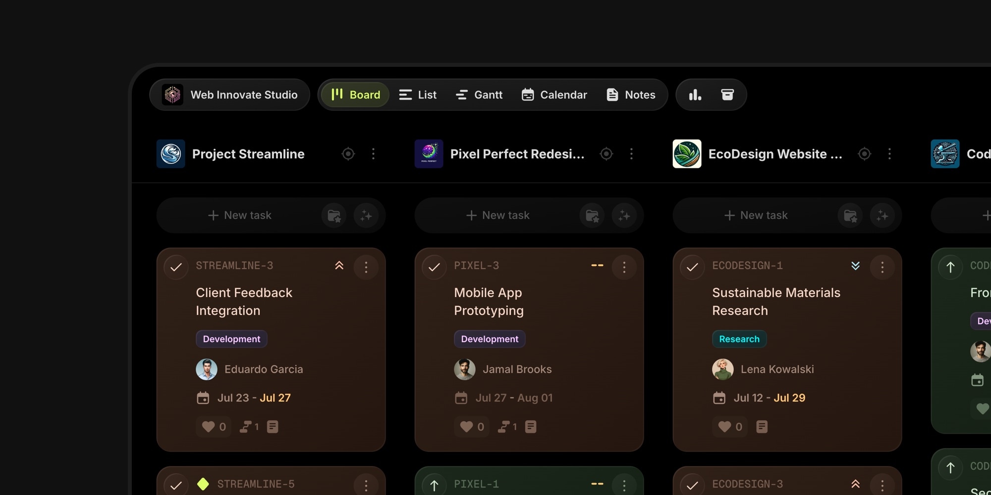
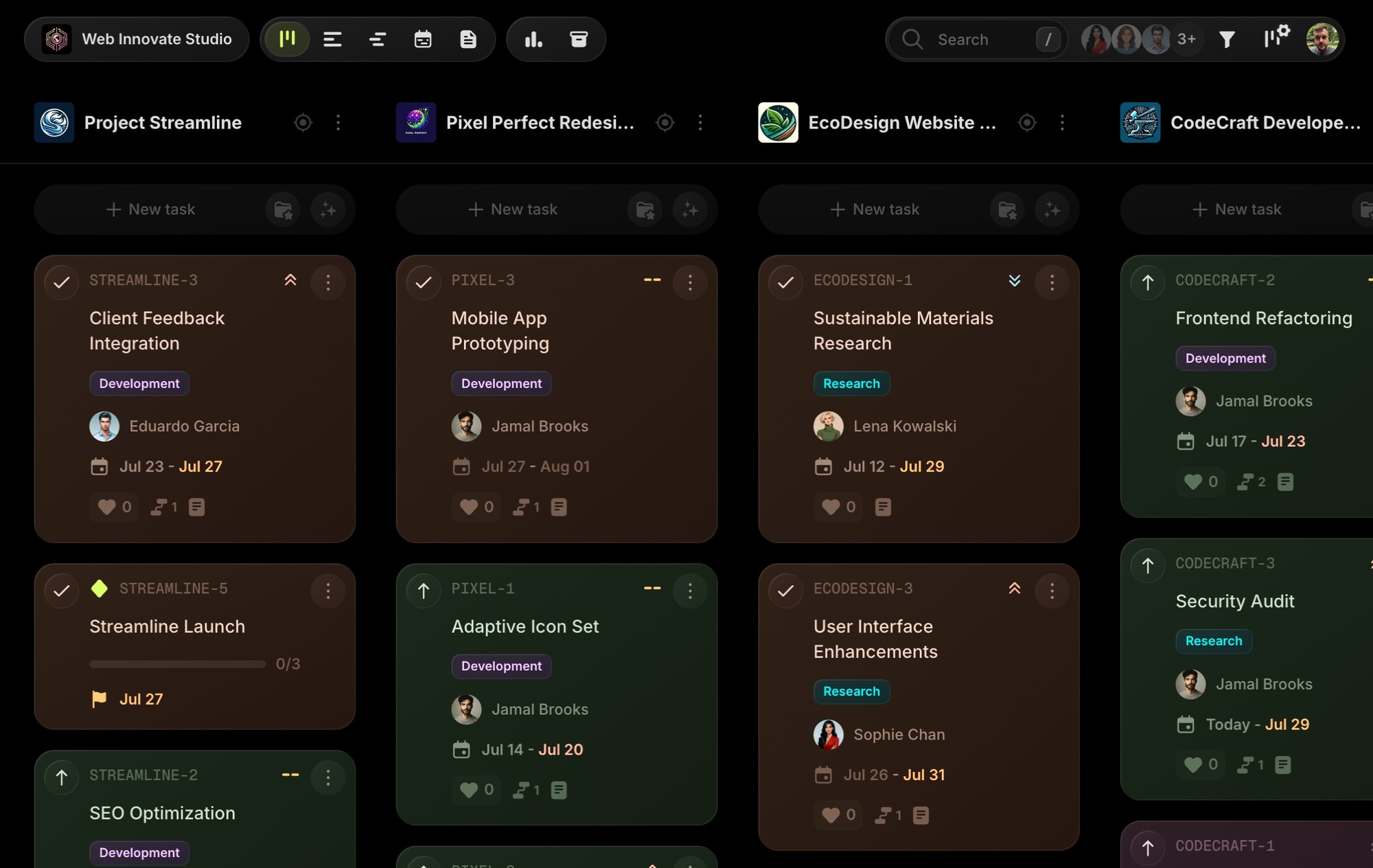
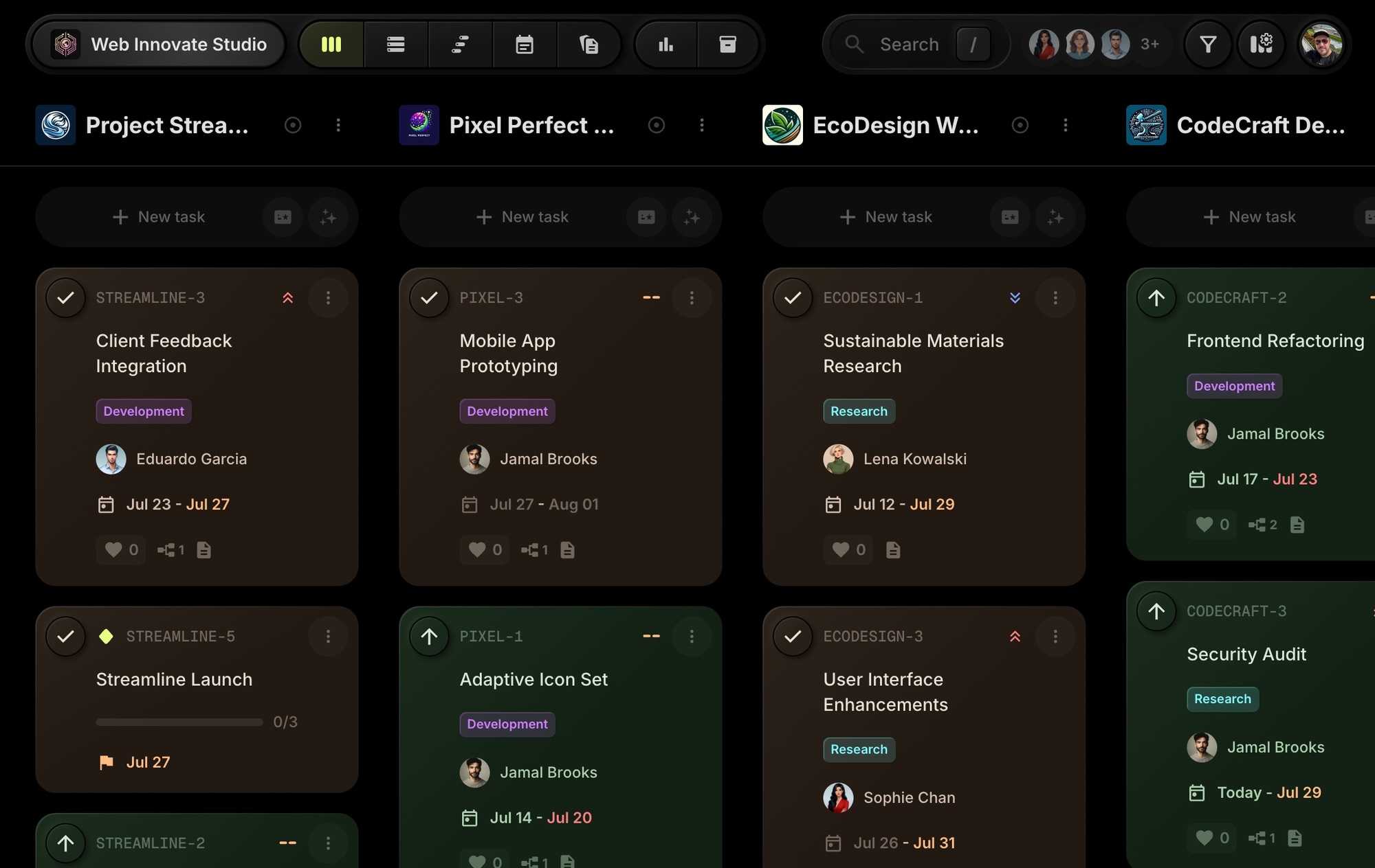
The board is where you spend most of your time, so this is where the change is most visible. The toolbar is lighter and grouped, cards are tighter, and the visual weight moved from the controls to your tasks. Same viewport, more work visible.
#Task Details
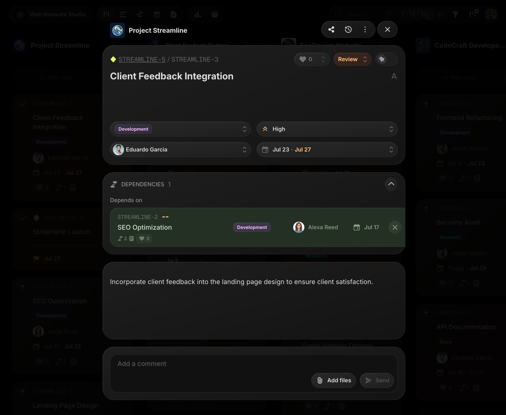
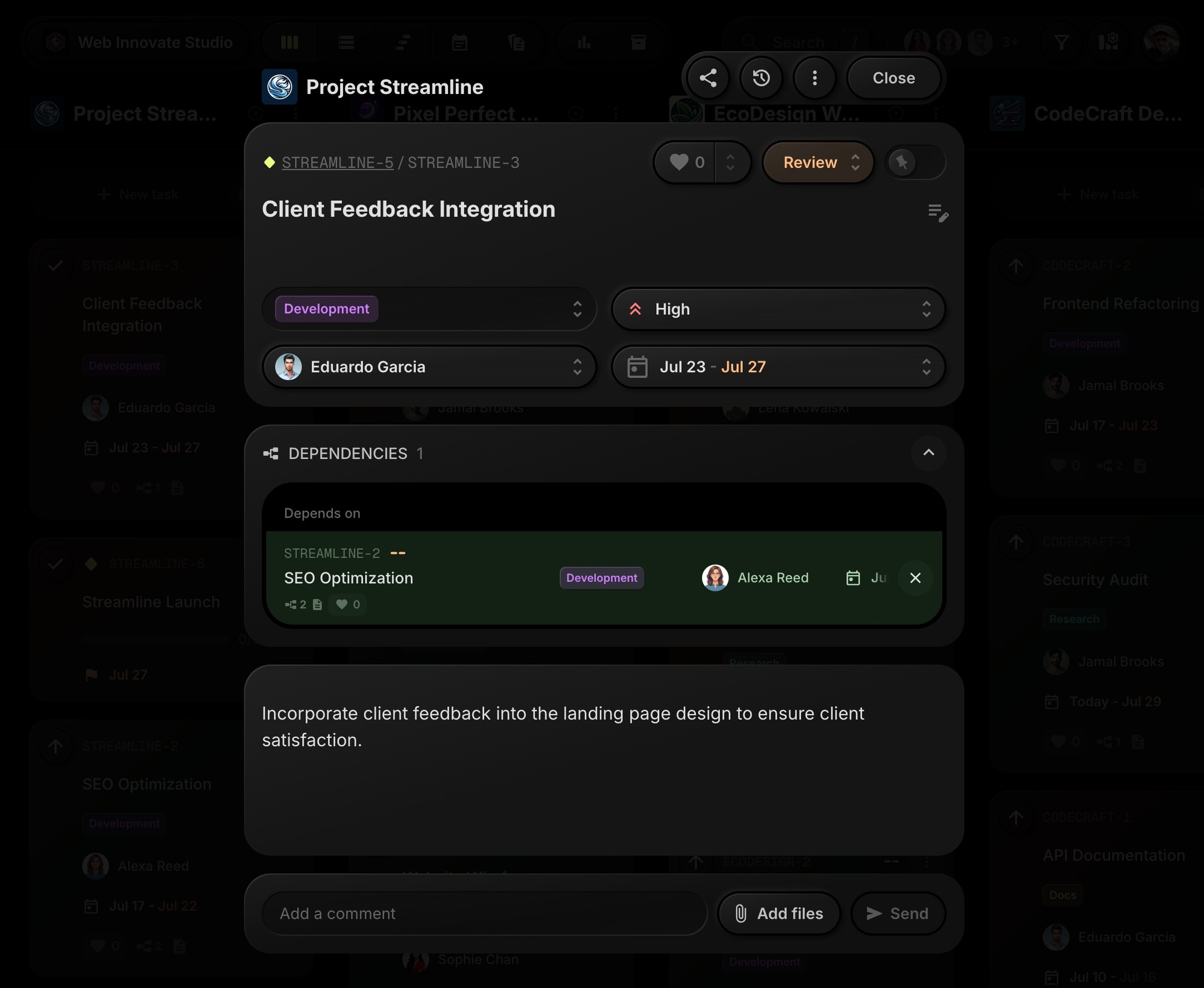
Task details got a calmer header, cleaner selects, and more room for what matters - the task itself. Notice how the dependency and priority controls keep their place but lose the heavy styling.
#List View
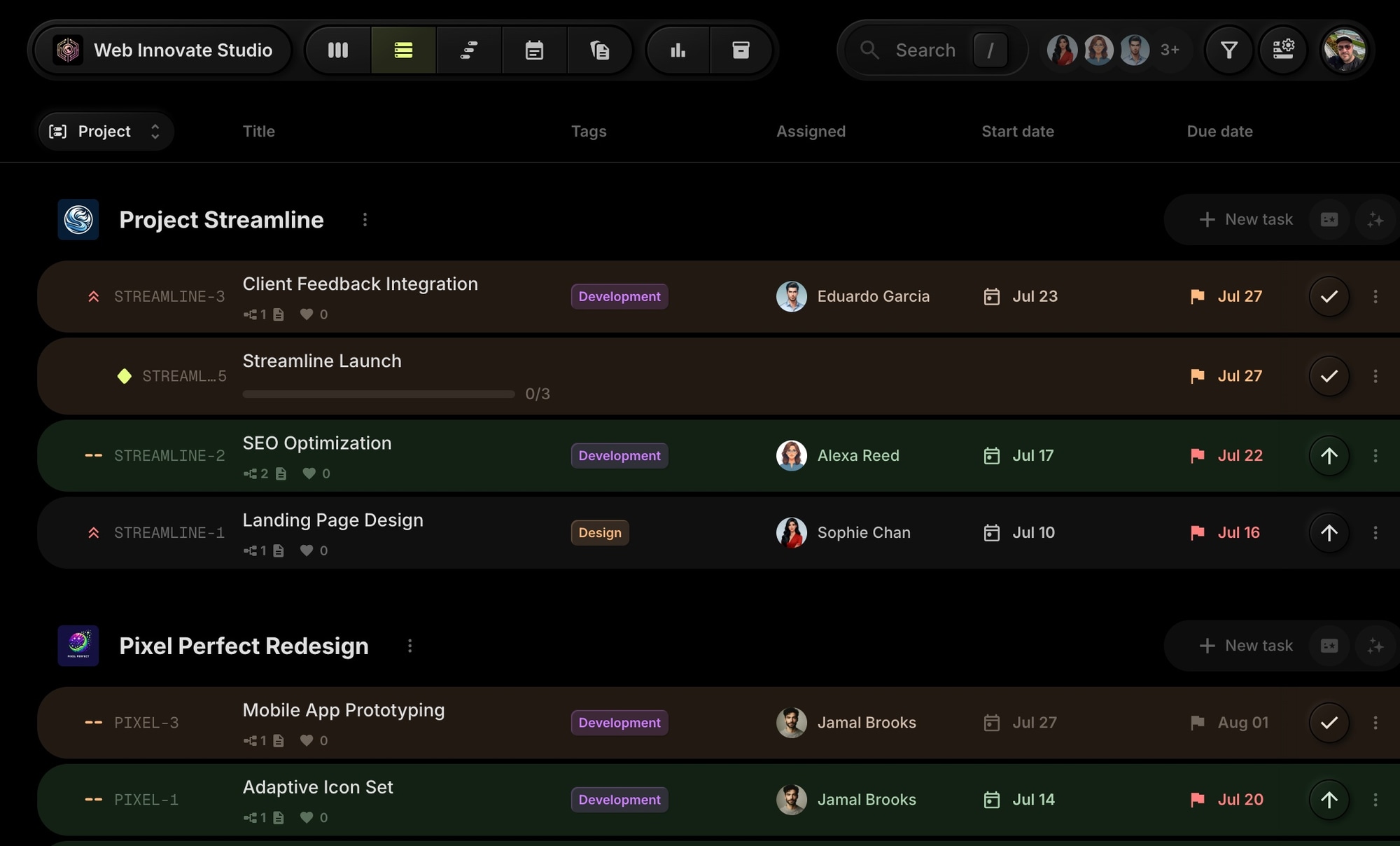
List view is built for scanning, and density matters most here. Rows are tighter, project titles that used to truncate now fit, and an extra task or two shows up in the same space.

#Calendar View
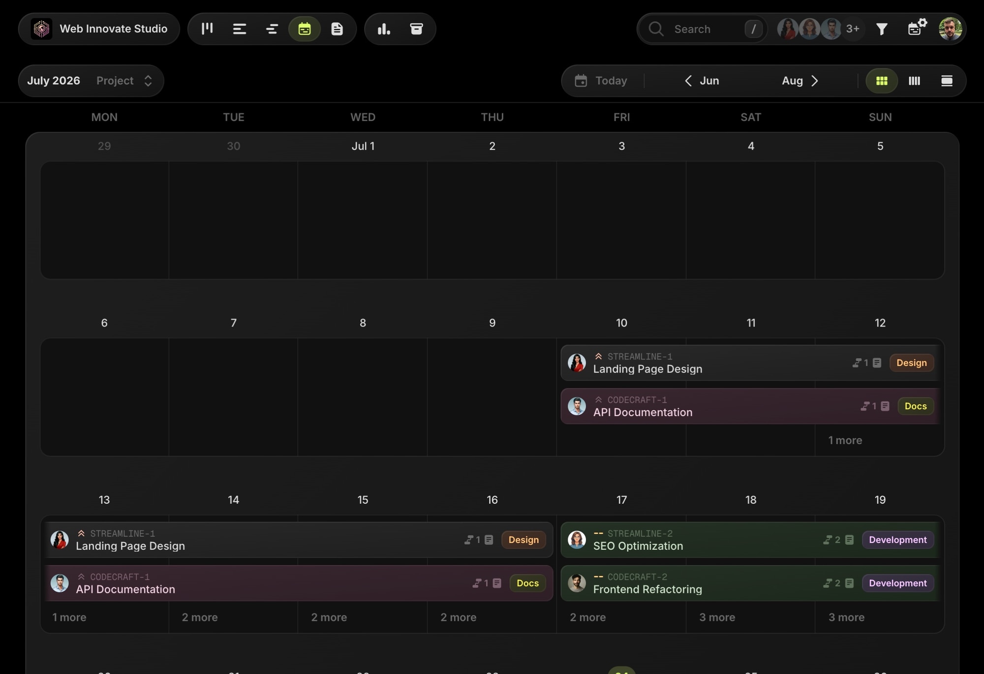
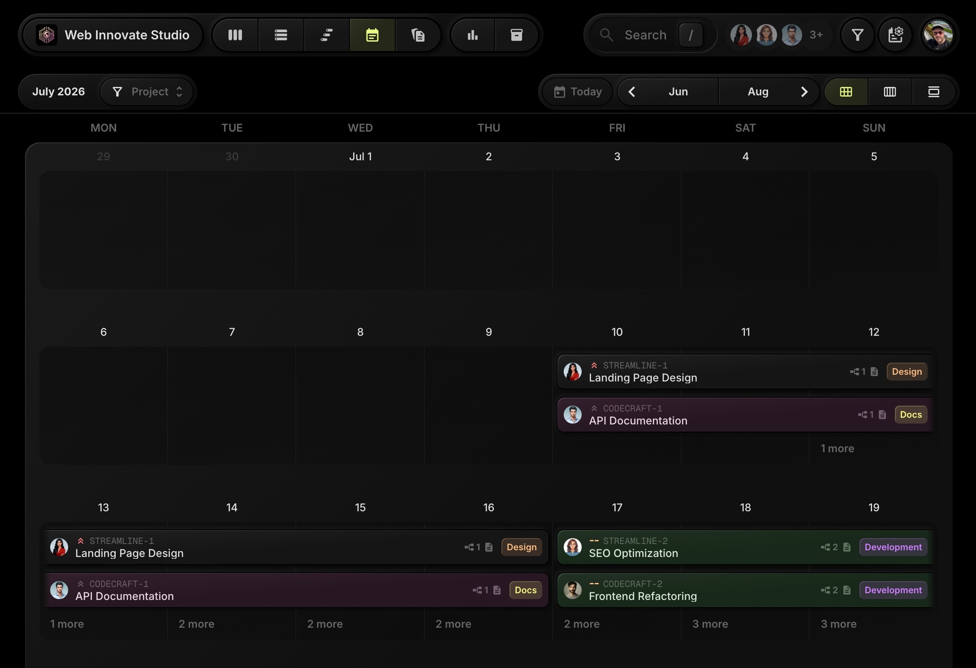
The calendar header slimmed down, giving the actual month more room. Task cards on dates are crisper with better contrast between the card and the grid.
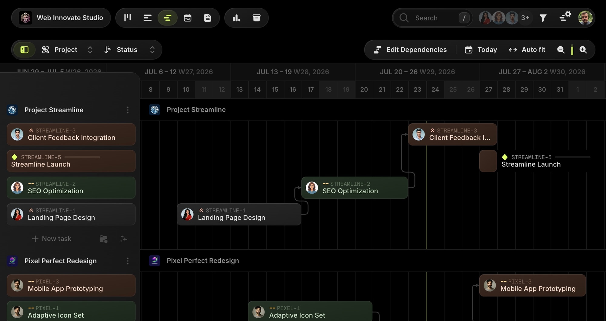
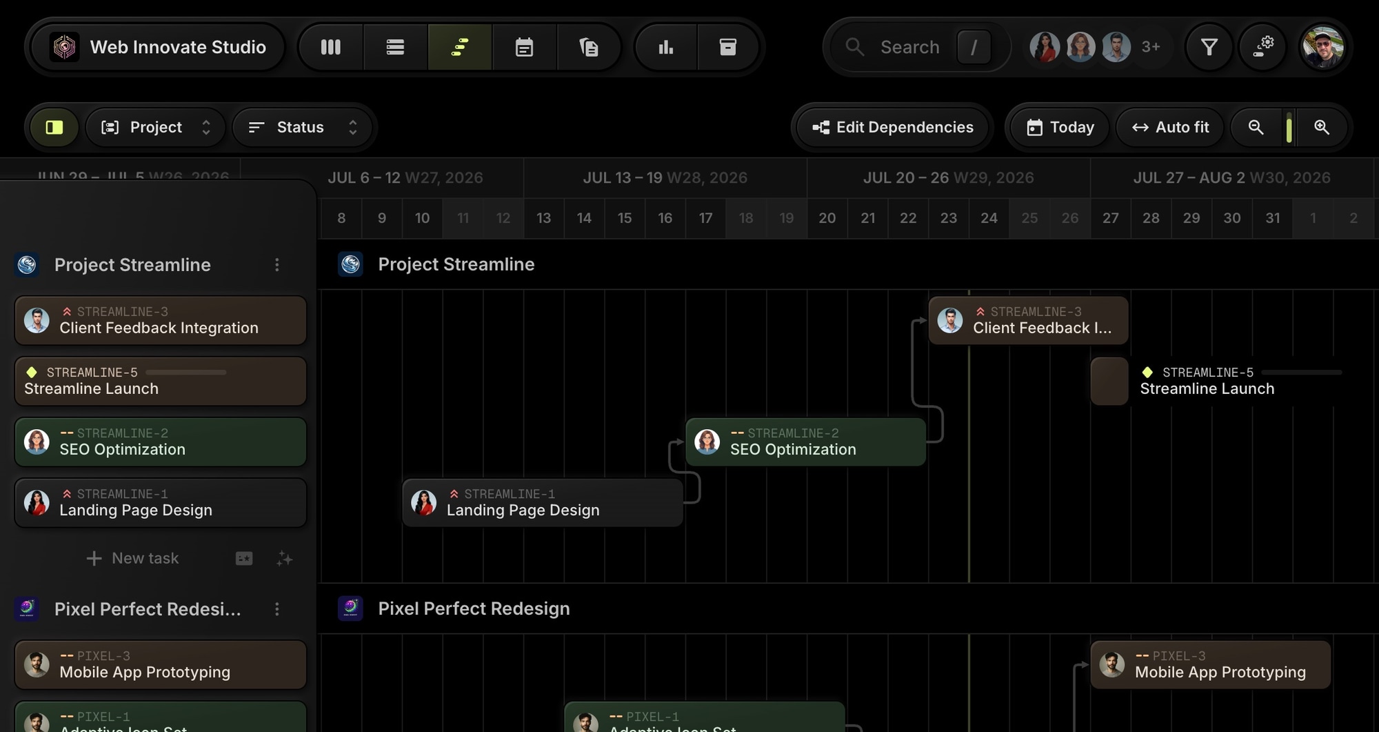
#Gantt Chart
The Gantt toolbar merged into a single clean bar, and the timeline itself gained vertical space. Dependencies and task bars read more clearly against the calmer background.
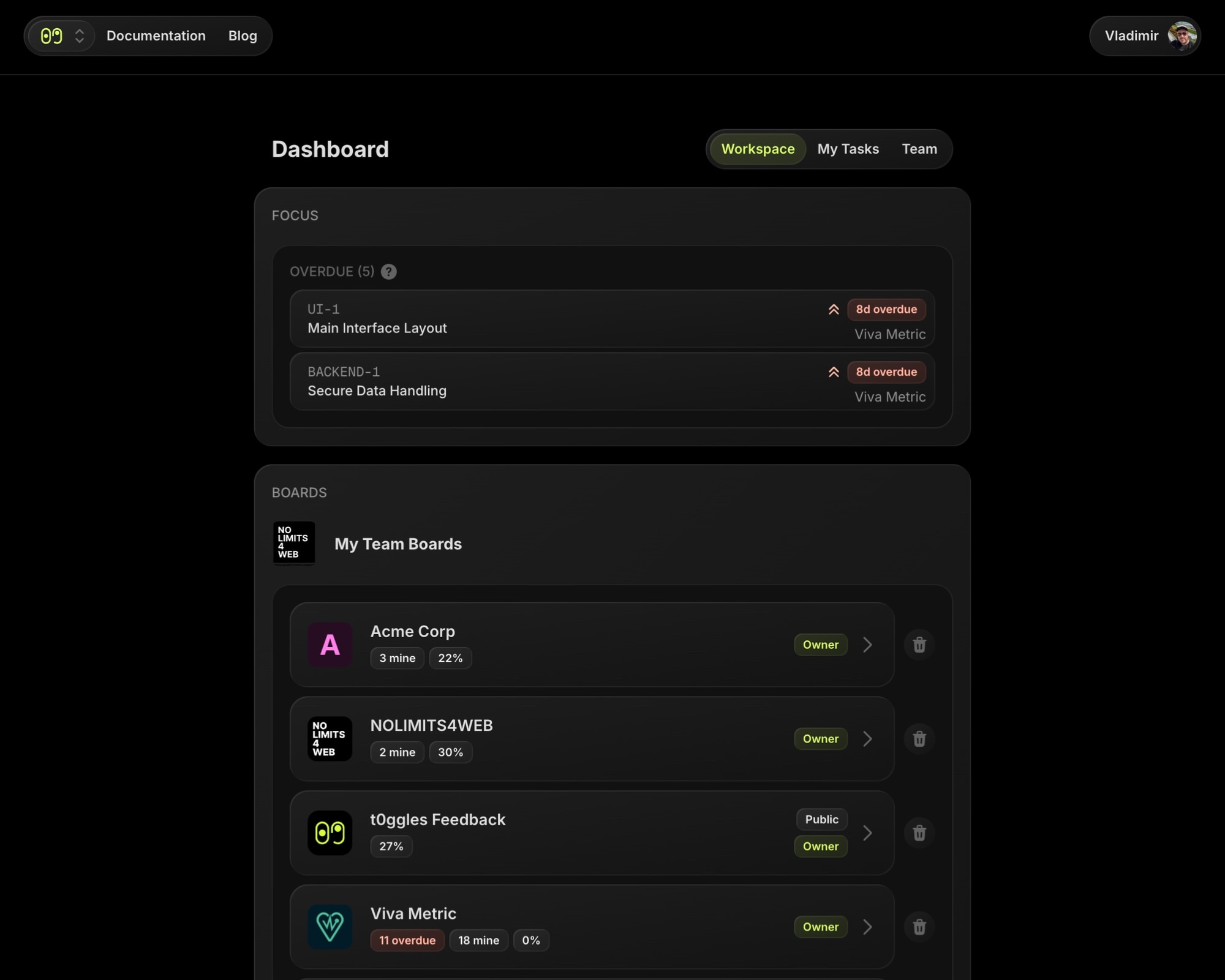
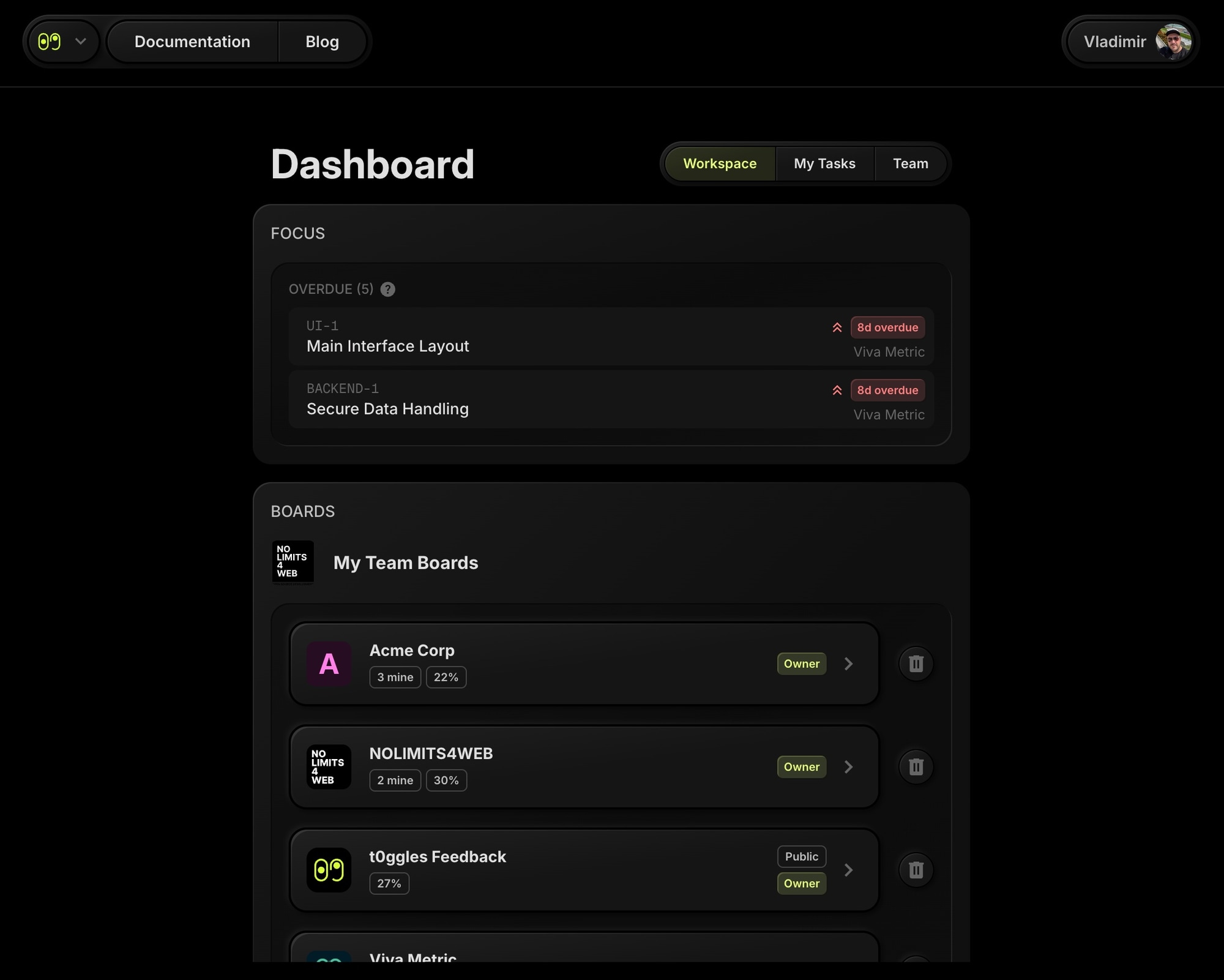
#Dashboard
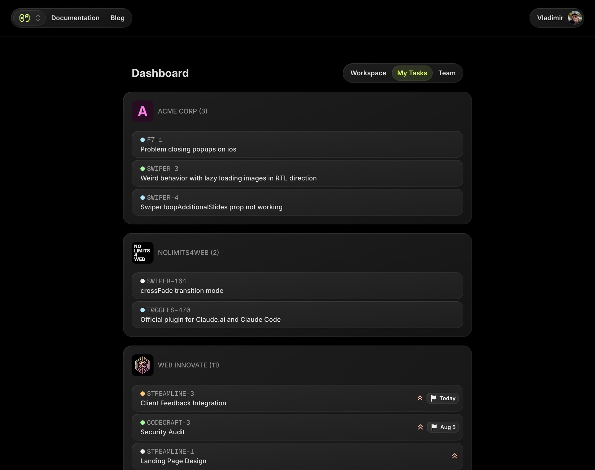
The dashboard navigation is tighter and board cards are more compact, so more of your boards fit on screen at once.
And the My Tasks view follows the same rhythm - your tasks across all boards, with less chrome around them:

#One Design System, All Our Products
This redesign is powered by cladd - our own open source React UI kit. cladd actually started its life as the t0ggles UI library, and it has since grown into the design system behind all of our products: Swiper Studio, PaneFlow, Start Page HQ, and now t0ggles itself.
For you, that means a consistent, polished experience across everything we build. For us, it means a UI that is far easier to maintain and evolve - so new t0ggles features ship faster, with design quality baked in from day one.
#The Details Matter Too
A rewrite this deep touches everything, so along the way we also:
- Fixed dozens of small UI issues and inconsistencies
- Updated every screenshot and video in the documentation to reflect the new design
- Refined both light and dark themes with better contrast in each
#See It Live
There is nothing to enable and nothing to migrate - the new design is already on your board. Open t0ggles, move some tasks around, and see how it feels.
New here? t0ggles is a fast, modern project management tool with multi-project boards, real-time collaboration, and AI-powered workflows - and now it looks the part. Start free - no card required - and see for yourself.
Spotted something off, or have thoughts on the new look? Tell us - feedback like yours shaped this redesign, and it will shape what comes next.
Also check the release notes for a quick technical summary of this update.
Don't Miss What's Next
Get updates, design tips, and sneak peeks at upcoming features delivered straight to your inbox.