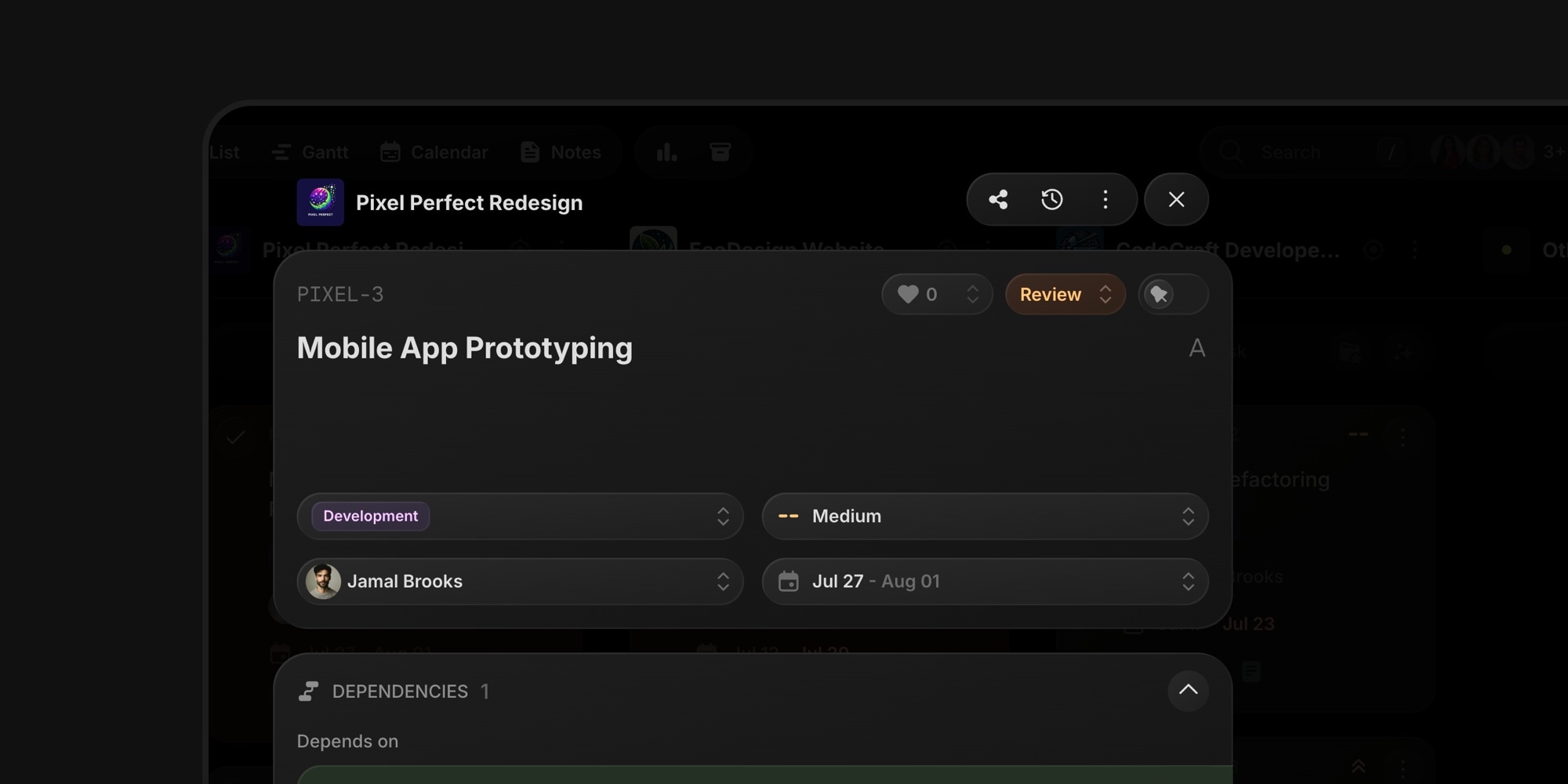
t0ggles has a brand new look. The entire interface was rebuilt from the ground up - every view, every control, every icon.
#What Changed
- Denser, cleaner layout - Tighter spacing across all views means more tasks and projects visible on screen, while keeping the UI breathable
- Better contrast, less noise - Fewer shadows and calmer surfaces let your content stand out instead of the interface
- All new icons - A complete new icon set designed for app UIs, with consistent stroke weights everywhere
- Unified look across views - Kanban, List, Calendar, Gantt, Notes, and Dashboard all follow the same refined visual language
- Dozens of small fixes - A rewrite this deep let us clean up long-standing minor UI issues and inconsistencies
Your workflow stays exactly the same - everything is where it was, it just looks and feels better.
#Under the Hood
The new UI is built on cladd, our open source React UI kit that started as the t0ggles UI library. cladd now powers all of our products - Swiper Studio, PaneFlow, Start Page HQ, and t0ggles - so improvements to the design system reach every product at once, and new t0ggles features ship faster with consistent design quality.
All screenshots and videos across the documentation have been updated to match the new design.
#Why This Matters
A project management tool lives or dies by how it feels during a full day of real work. When your team plans sprints, grooms backlogs, and tracks deadlines in the same interface for hours, visual clarity compounds - less noise means faster scanning, and higher density means fewer scrolls to see the full picture of your projects.
#See the Full Story
We published a full before and after comparison of every view - Kanban board, task details, List, Calendar, Gantt chart, and Dashboard.